GÜI
The question that started everything: what kind of brand could hold everything I am?
The design studio, the DJ sets, the vinyl collection, the side projects, the constant need to explore. I didn't want to start from zero every time something new came up. I wanted a brand that could grow with me.
The reference that unlocked everything was Kitsuné: café, clothing label, record label, all under one name. That multi-world logic became the structural foundation of GÜI.
And the creative spark came from somewhere more unexpected: Björk's Debut album. Listening to it on repeat, I kept recognizing the energy I wanted the brand to have: enthusiasm, fantasy, sensuality, full confidence. It moves from noise and euphoria to softness, without asking permission. That became the brief.
Creative direction
Brand ADN
Brand design
Logo design
Content design
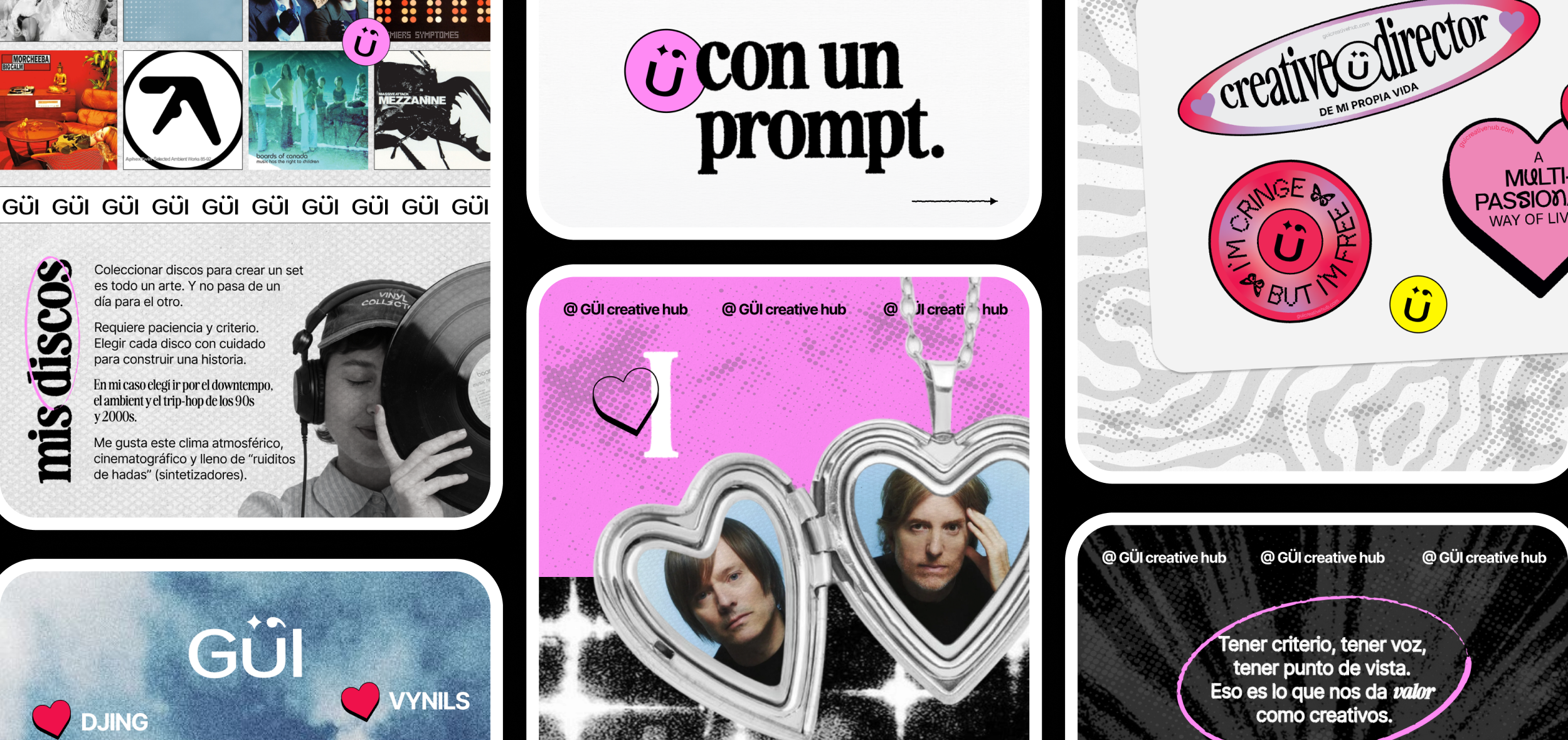
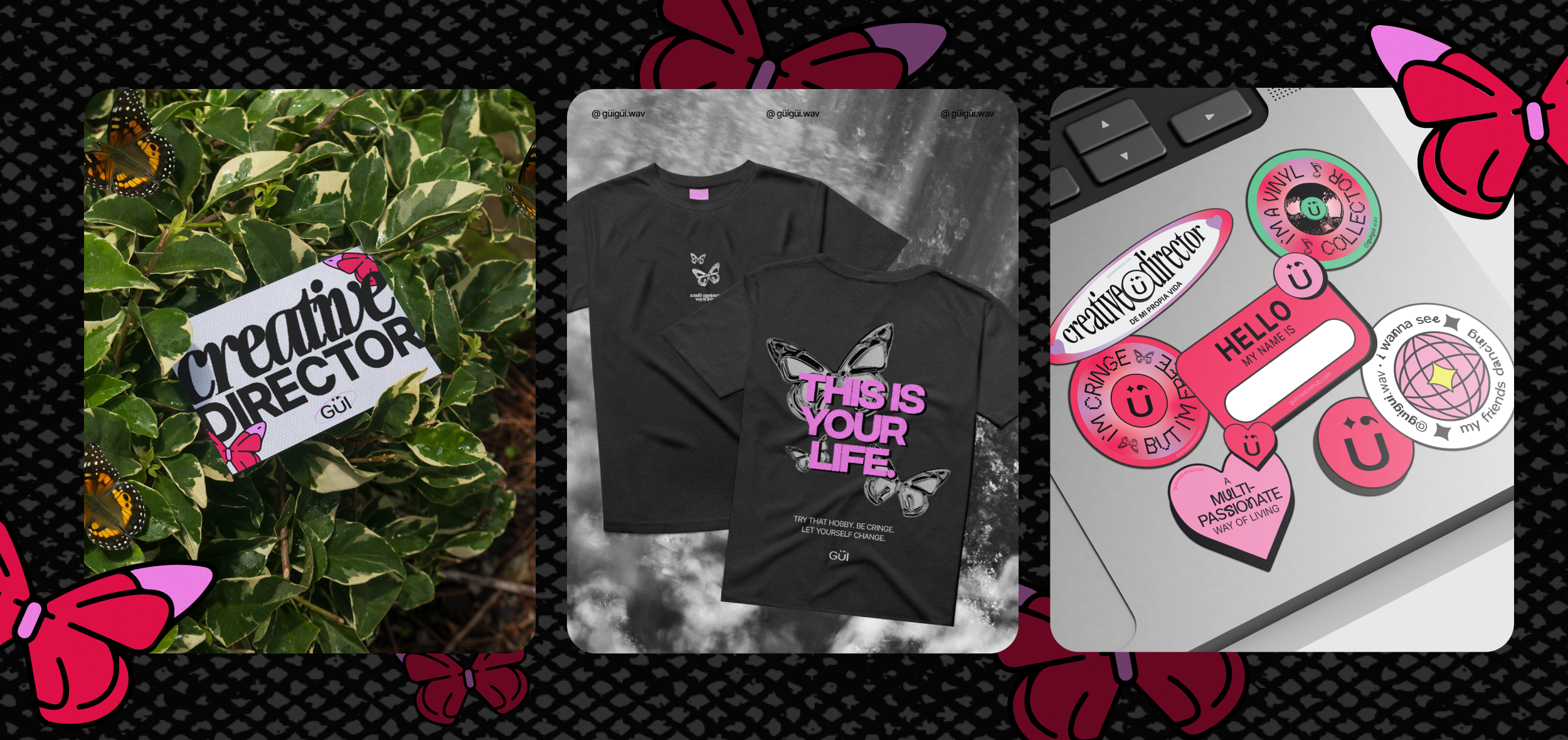
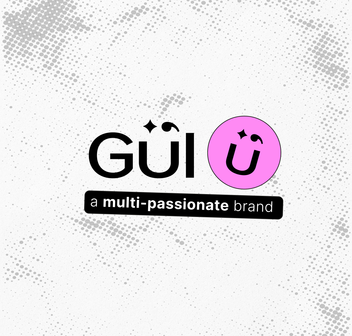
The name & logo: GÜI comes from Güiraldes. We played with the diaeresis (Ü) to create a small happy face built into the wordmark. It sounds joyful. It feels open and creative.
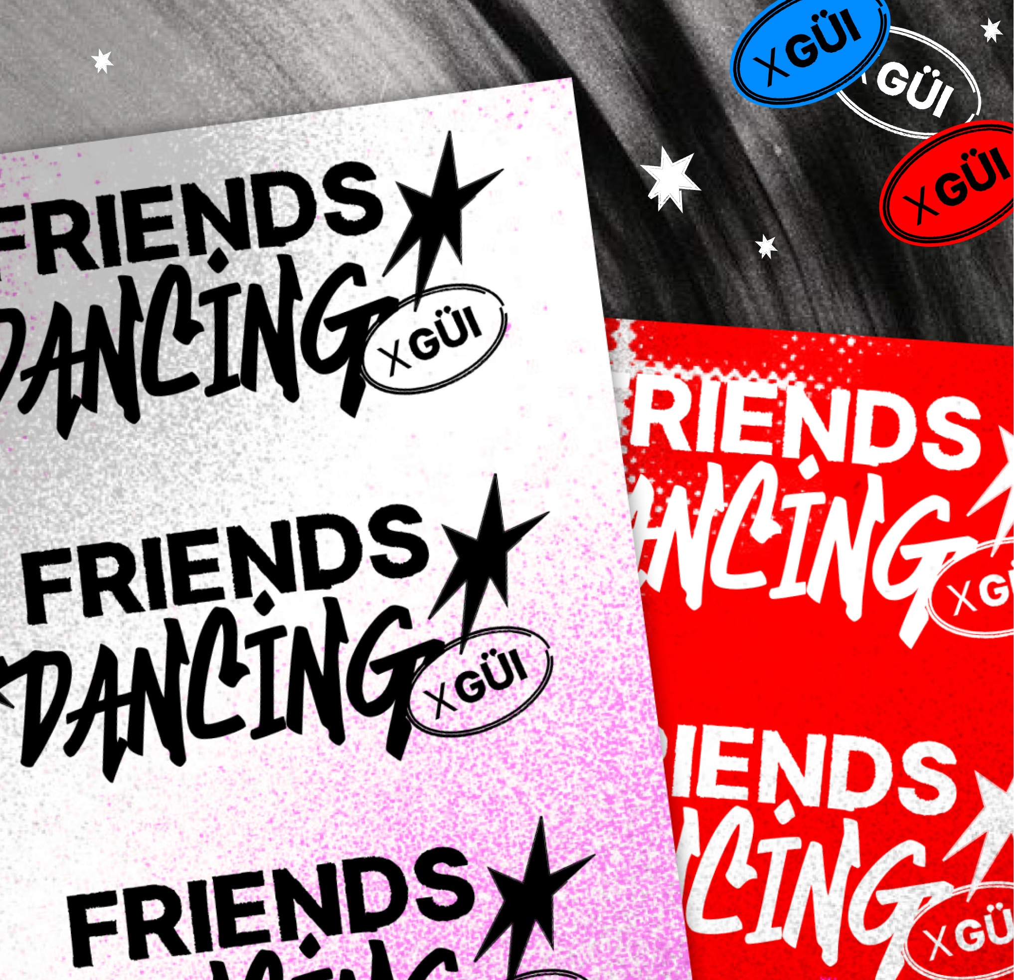
A universe of logos: GÜI Creative Hub (the studio), GÜI Project (experiences and side projects), GÜIgüi (my DJ alter ego). Each has its own identity, but they all live in the same world.
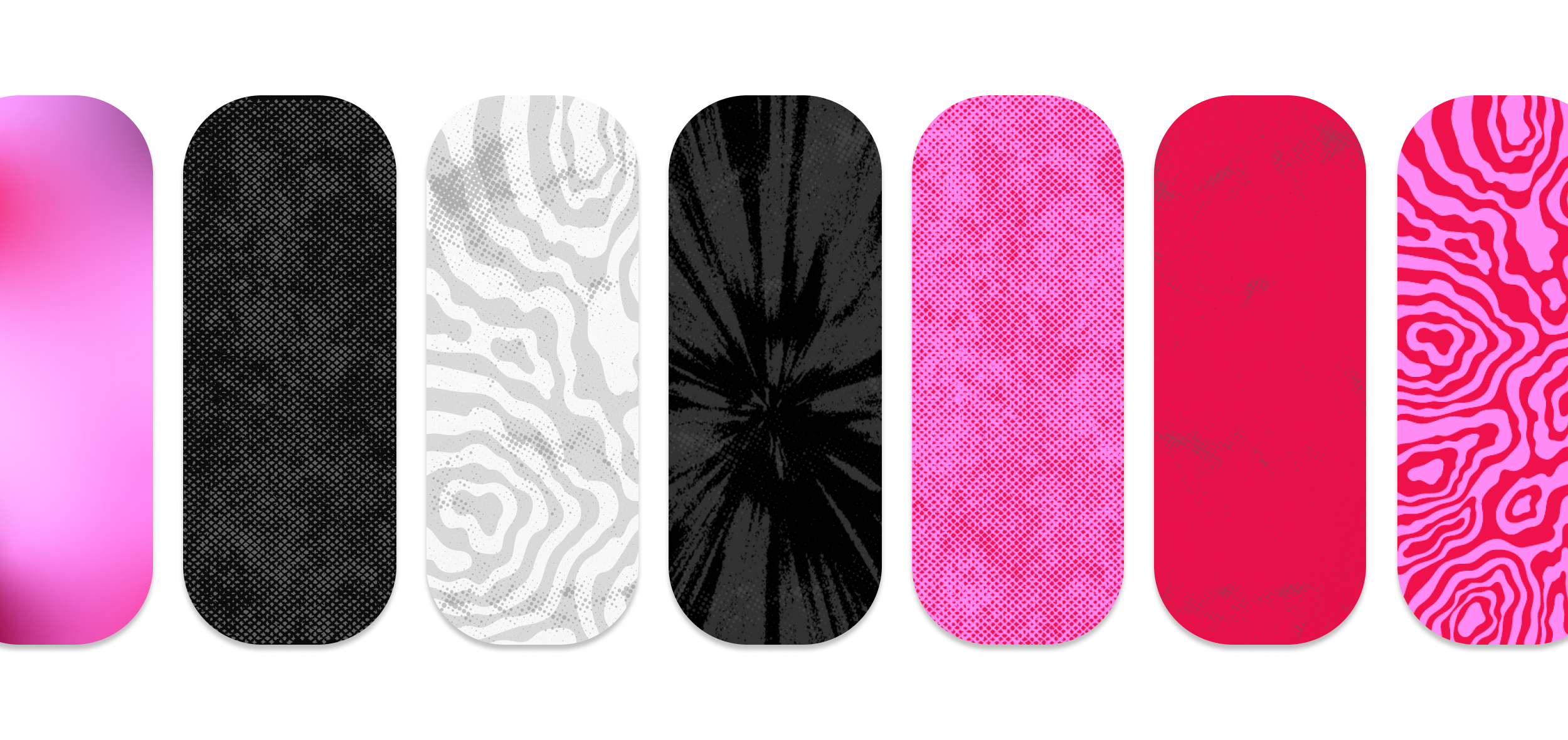
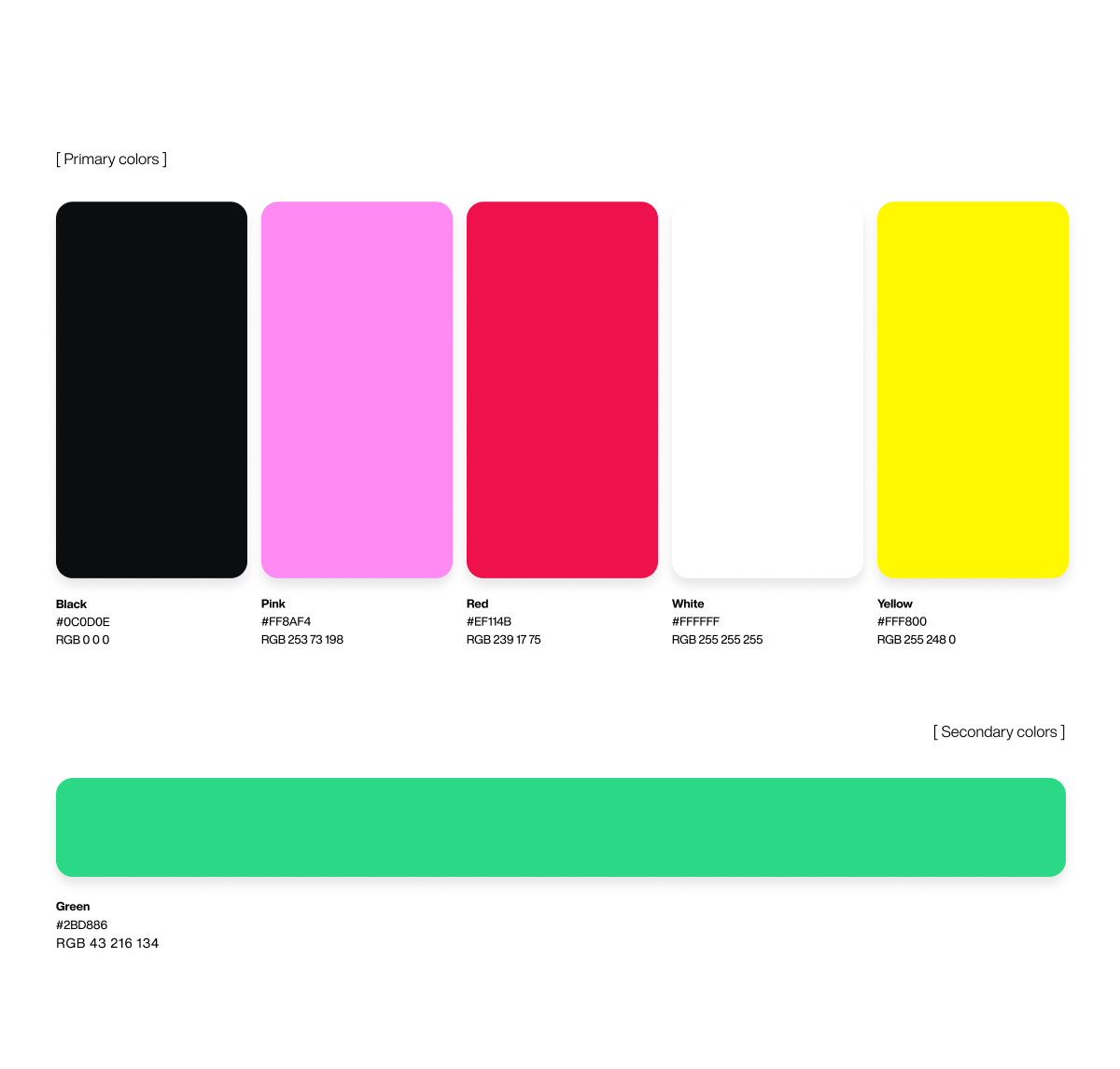
Color: red + pink: vibrant and passionate, without being aggressive. It doesn't blend into anything else.
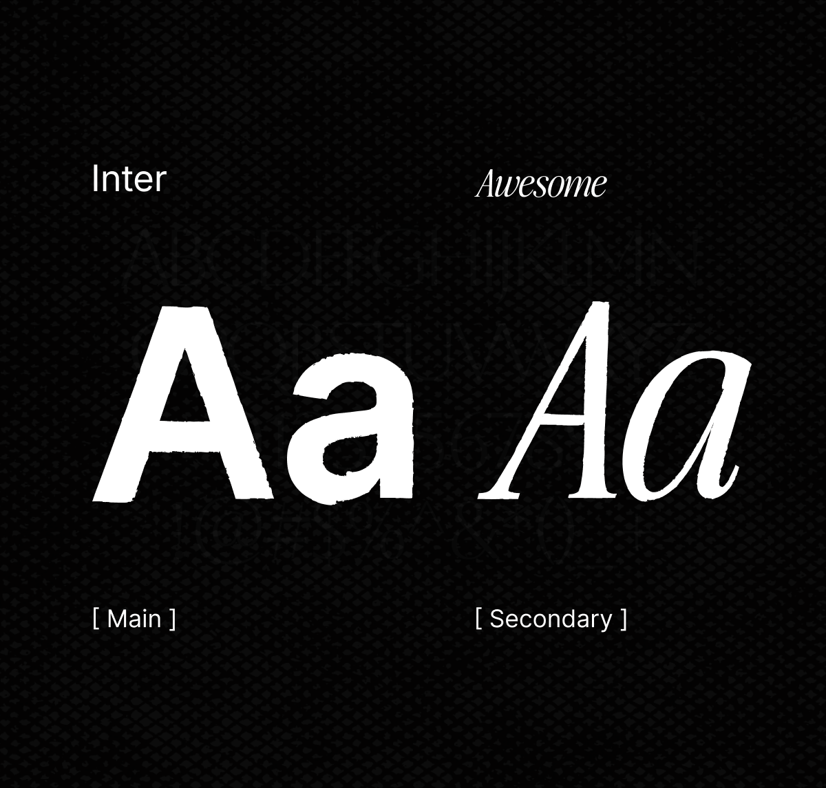
Typography: Inter as the base. Each sub-project gets its own typographic pairing on top.
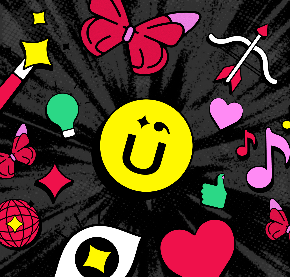
Custom iconography & stickers: icons that map my entire world. I loved them so much I got them tattooed. That's how you know they're right.
Cute + grunge: noise texture added to the system so it wouldn't tip into being too sweet. The tension is intentional.
We built GÜI as a team, which made all the difference. We love teamwork!

Other Projects


Connect with us to explore your project's potential.


OFFICE
Buenos Aires, Argentina
CONTACT
guicreativehub@gmail.com
SOCIAL

GÜI
The question that started everything: what kind of brand could hold everything I am?
The design studio, the DJ sets, the vinyl collection, the side projects, the constant need to explore. I didn't want to start from zero every time something new came up. I wanted a brand that could grow with me.
The reference that unlocked everything was Kitsuné: café, clothing label, record label, all under one name. That multi-world logic became the structural foundation of GÜI.
And the creative spark came from somewhere more unexpected: Björk's Debut album. Listening to it on repeat, I kept recognizing the energy I wanted the brand to have: enthusiasm, fantasy, sensuality, full confidence. It moves from noise and euphoria to softness, without asking permission. That became the brief.
Creative direction
Brand ADN
Brand design
Logo design
Content design
The name & logo: GÜI comes from Güiraldes. We played with the diaeresis (Ü) to create a small happy face built into the wordmark. It sounds joyful. It feels open and creative.
A universe of logos: GÜI Creative Hub (the studio), GÜI Project (experiences and side projects), GÜIgüi (my DJ alter ego). Each has its own identity, but they all live in the same world.
Color: red + pink: vibrant and passionate, without being aggressive. It doesn't blend into anything else.
Typography: Inter as the base. Each sub-project gets its own typographic pairing on top.
Custom iconography & stickers: icons that map my entire world. I loved them so much I got them tattooed. That's how you know they're right.
Cute + grunge: noise texture added to the system so it wouldn't tip into being too sweet. The tension is intentional.
We built GÜI as a team, which made all the difference. We love teamwork!

Other Projects

Connect with us to explore your project's potential.


OFFICE
Buenos Aires, Argentina
CONTACT
guicreativehub@gmail.com
SOCIAL

GÜI
The question that started everything: what kind of brand could hold everything I am?
The design studio, the DJ sets, the vinyl collection, the side projects, the constant need to explore. I didn't want to start from zero every time something new came up. I wanted a brand that could grow with me.
The reference that unlocked everything was Kitsuné: café, clothing label, record label, all under one name. That multi-world logic became the structural foundation of GÜI.
And the creative spark came from somewhere more unexpected: Björk's Debut album. Listening to it on repeat, I kept recognizing the energy I wanted the brand to have: enthusiasm, fantasy, sensuality, full confidence. It moves from noise and euphoria to softness, without asking permission. That became the brief.
The name & logo: GÜI comes from Güiraldes. We played with the diaeresis (Ü) to create a small happy face built into the wordmark. It sounds joyful. It feels open and creative.
A universe of logos: GÜI Creative Hub (the studio), GÜI Project (experiences and side projects), GÜIgüi (my DJ alter ego). Each has its own identity, but they all live in the same world.
Color: red + pink: vibrant and passionate, without being aggressive. It doesn't blend into anything else.
Typography: Inter as the base. Each sub-project gets its own typographic pairing on top.
Custom iconography & stickers: icons that map my entire world. I loved them so much I got them tattooed. That's how you know they're right.
Cute + grunge: noise texture added to the system so it wouldn't tip into being too sweet. The tension is intentional.
We built GÜI as a team, which made all the difference. We love teamwork!
Creative direction
Brand ADN
Brand design
Logo design
Content design

Other Projects

Connect with us to explore your project's potential.


OFFICE
Buenos Aires, Argentina
CONTACT
guicreativehub@gmail.com
SOCIAL